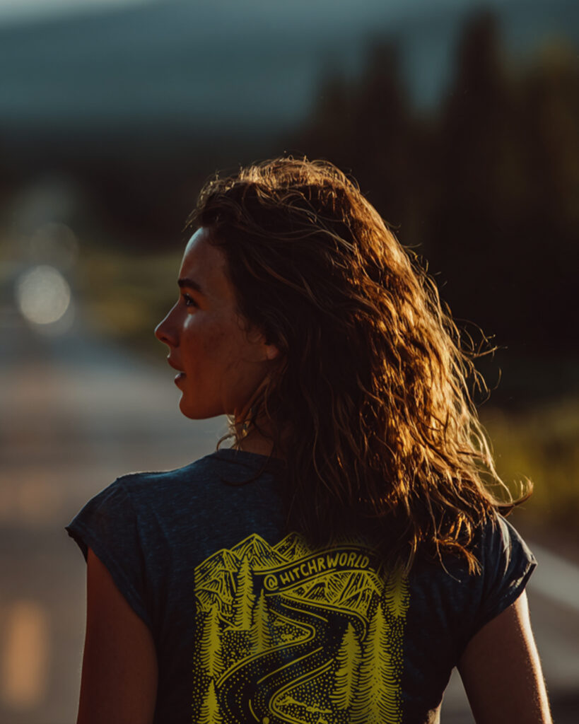
Some ideas work best when they’re simple enough to travel. For Hitchr, we developed an illustration system rooted in movement, openness, and the quiet optimism of the road – designed to live anywhere the brand showed up.
Client
HITCHR
Services
ILLUSTRATION / VISUAL SYSTEM / CREATIVE DIRECTION
Year
2025
Overview
Hitchr needed a visual language that felt human, hopeful, and instantly recognisable – something that could represent a movement, not just a product.
We were brought in to create a set of illustrations that could act as the backbone of the brand – flexible enough to scale, but distinctive enough to feel owned. The goal wasn’t to design outputs. It was to design something that could carry meaning wherever it appeared.
Tactics
We built a small but intentional illustration system inspired by road signage, screen-print graphics, and the universal language of hitchhiking.
Developed a core visual idea built around the road and the thumb
Designed illustrations to work as standalone pieces or as a cohesive set
Kept the system deliberately simple, bold, and adaptable
Ensured the work could translate across print, merchandise, and future brand touchpoints
Every illustration was designed to feel at home on the road – uncomplicated, durable, and easy to recognise from a distance.
HONEST Results
The illustrations became a unifying visual thread for Hitchr – helping support a successful crowdfunding campaign and giving the brand a clear, ownable identity.
More importantly, the system was built to last – flexible enough to evolve, but strong enough to remain recognisable wherever it appears.